Publicar


Publicar
Brand design and brand architecture: the transformation of phone books was a global phenomena. We helped Publicar, a phone book brand, evolve into a brand that offers advertising consulting and multimedia strategies. Publicar’s new bet was to offer multimedia advertising services.
Publicar, is a renowned brand in Colombia. It was undergoing a transformation process, where it needed to refresh its visual identity and define a brand architecture system that helped them organize their services. The brand had strong visual assets, different business lines and multiple resources for customers to find what they were looking for.
After research and analysis, we decided to approach the project in a way that respected the visual elements that were widely recognized by their users. We then designed a clean brand in its structure, but a powerful and versatile system in its different applications.
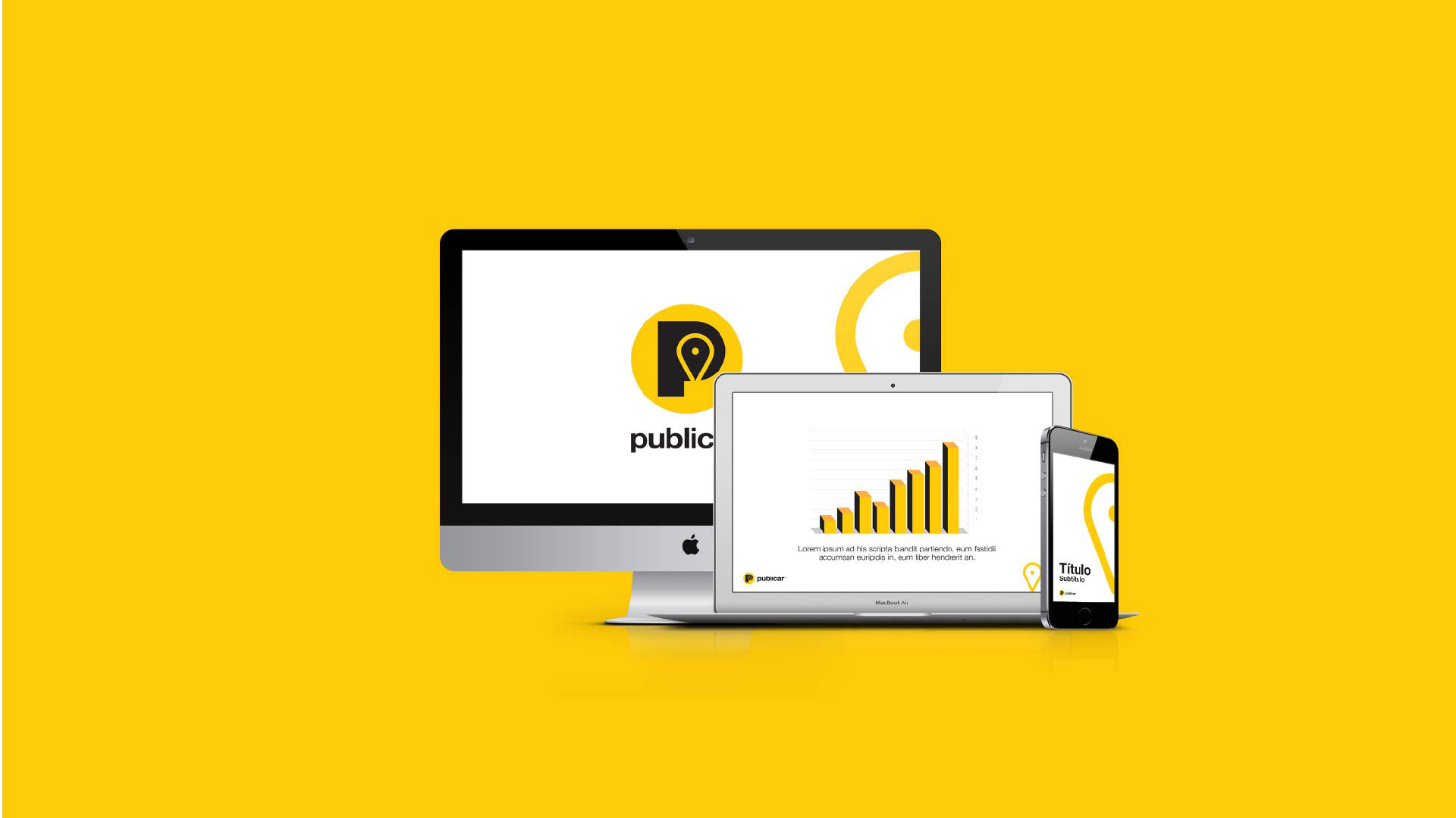
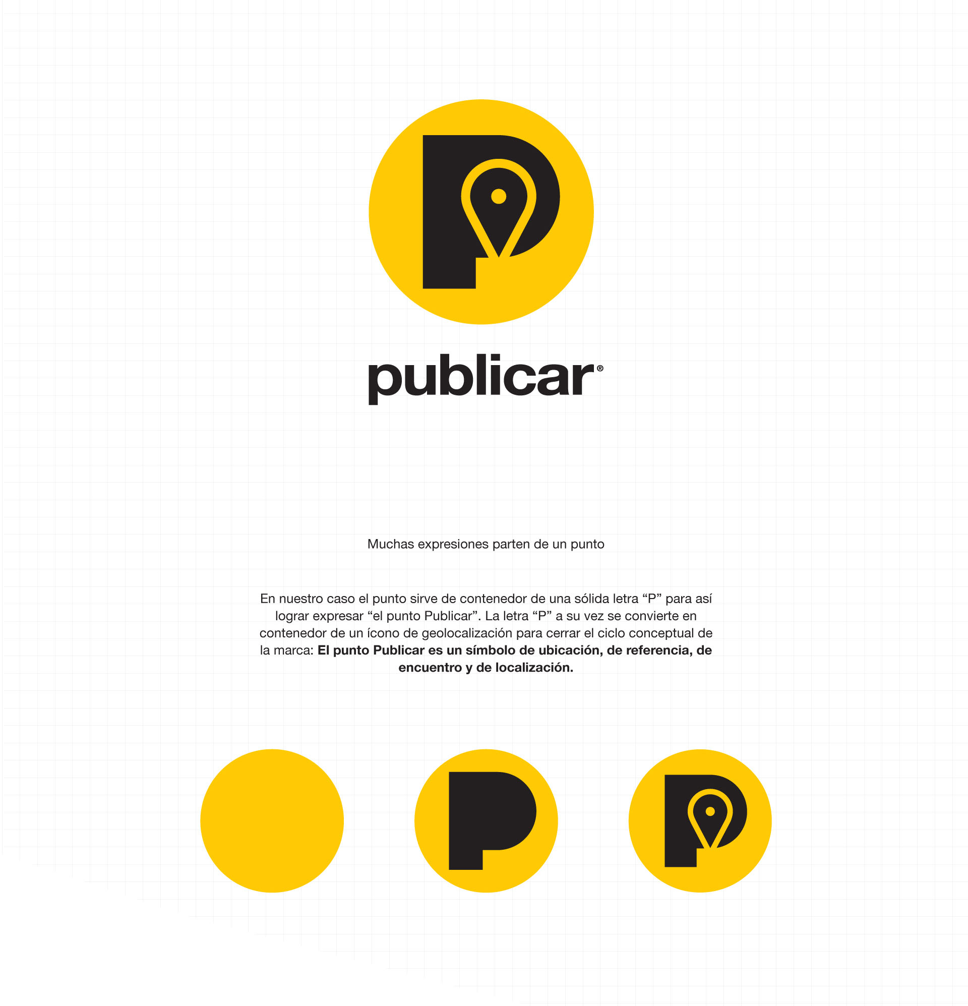
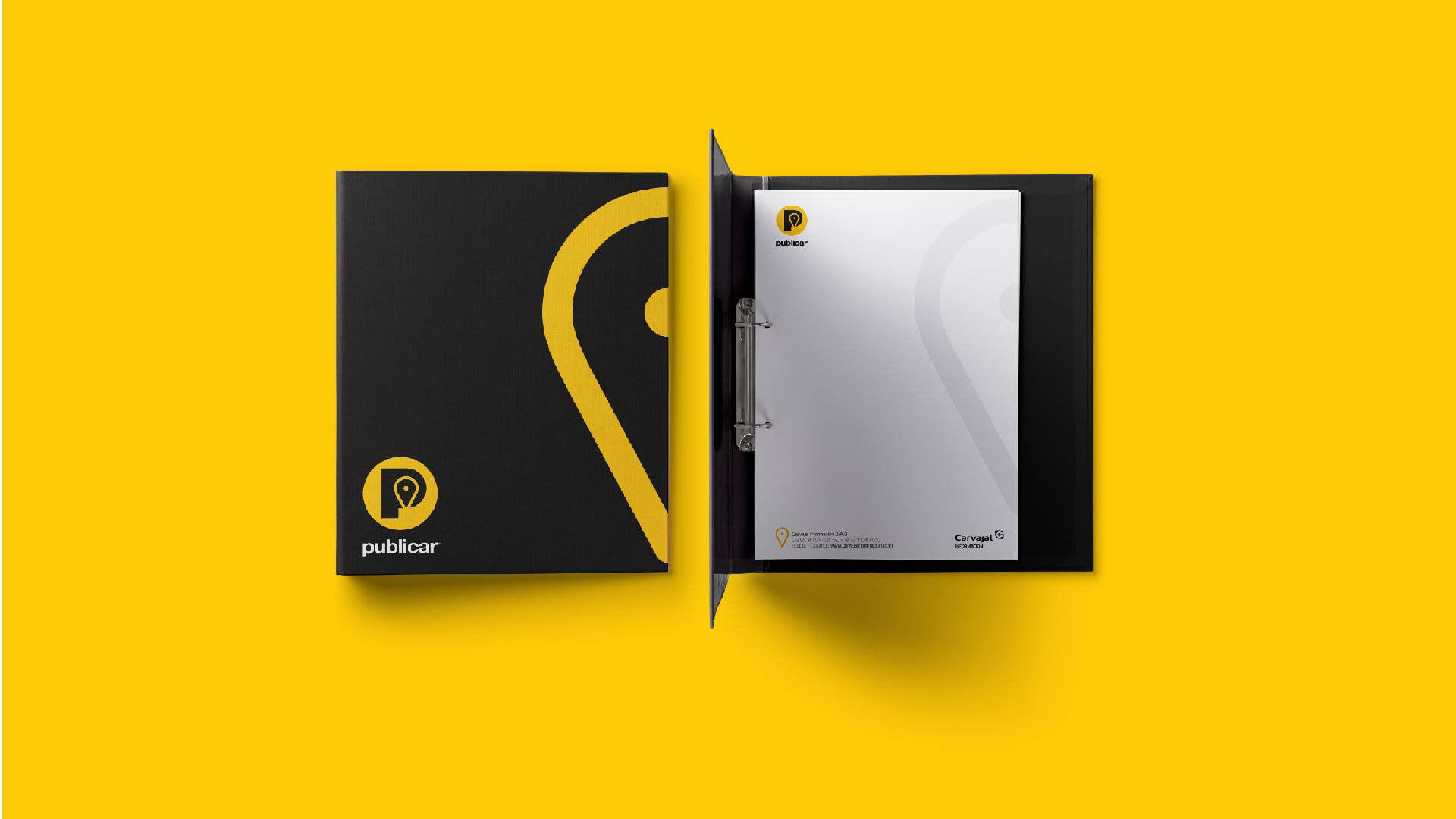
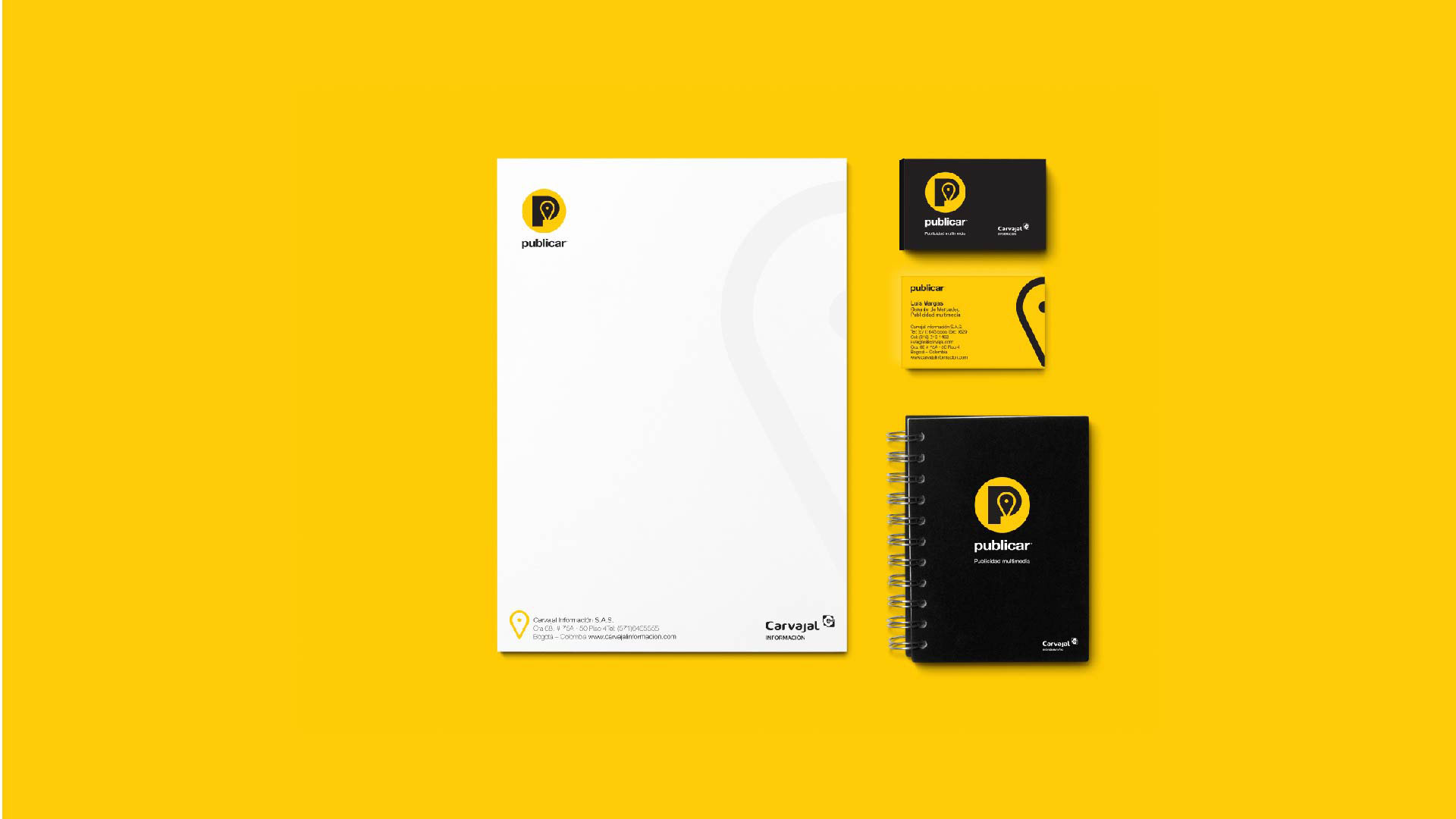
For this branding project we created a visual system that allows the logo to have small modifications when needed. This way we allow the brand to talk about different product categories, while the most important visual assets of the brand remain present. The P from Publicar was taken as main visual element, merging its shape with that of a location tag. This tag represents a point of reference and a site where different roads meet. Yellow has always been a very important asset for Publicar, therefore we kept this color scheme throughout the design and its applications. We were aware that the color combination between yellow and black is a visual code that is constantly used in signage. We used this visual code to promote a brand imagery that will ultimately help audiences feel as if they are find something.
Info
Branding