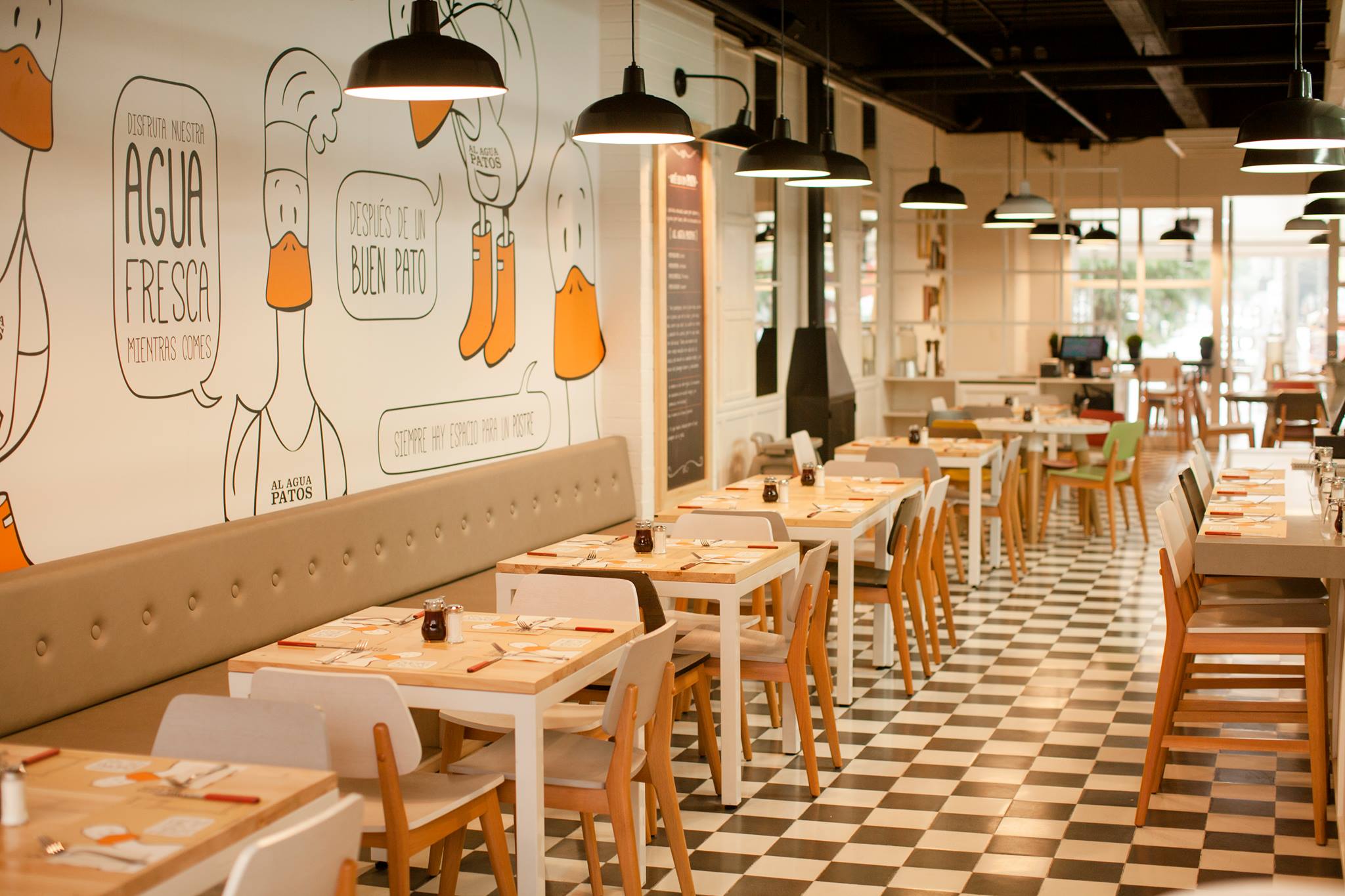
Al Agua Patos
Al Agua Patos
Visual identity
Our challenge: to make tangible the name of the brand “Al Agua Patos” (a expression in spanish that means “jump into the water”). We worked in the visual identity, graphic design and experience design in the restaurant’s touchpoints.
We designed a creative, friendly and surprising visual identity. A design system filled with personality and close to people’s hearts. We met our client, Patricia Bueno, who family and friends call ‘Pato’ (short for Patricia but also the same word for “duck” in spanish). It was clear to us the importance of portraying the DNA she had defined for her brand. It was time to tell the story of a young entrepeneur to start a new business and take the risk of jumping into the water… There was no name that best suited the new endeavor than the expression “Al agua patos”, used in the Colombian context to encourage others to jump into a circumstance despite any fear.
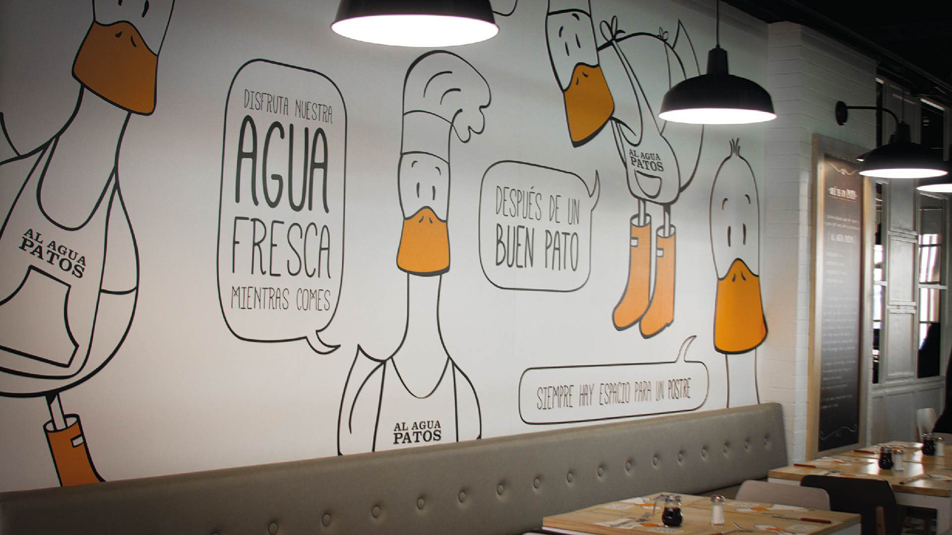
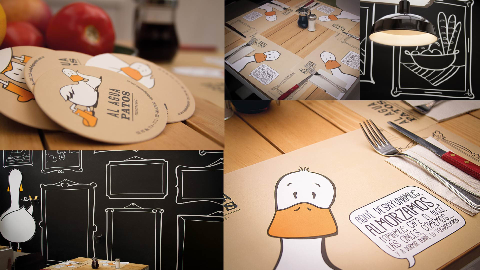
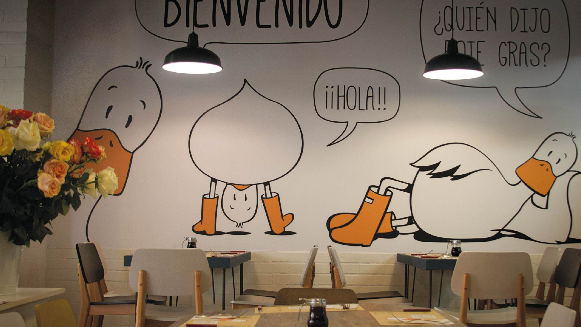
During the design process for this branding project, we designed graphic expressions to fill every touchpoint in the restaurant. By taking into account every single detail, we tell a story filled with fun.
For this brand we designed a main character that allowed us to establish a special connection with “Al Agua Patos” customers. As a result, this main character directly speaks to the customers in different places of the restauran: the menu, the walls, the coasters…
“Jump into the water. It is a very common expression we use in Colombia to talk about that moment when we are about to dare to start something new or attempt to achieve something that seems impossible. This is what I did, I jumped into the water, I started this business from scratch. This is a literal story of “Ducks, jump into the water!” Patricia Bueno, Al Agua Patos founder.
Info
Branding, P.O.P. material