Doña Pepa
Doña Pepa
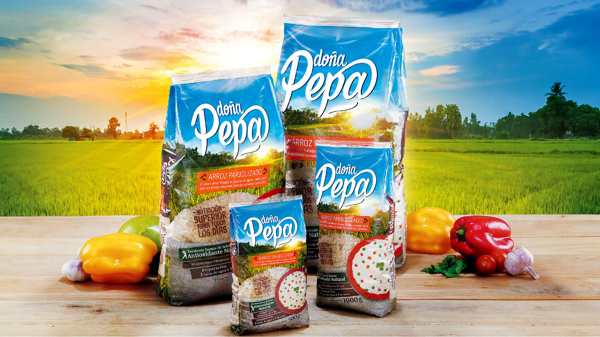
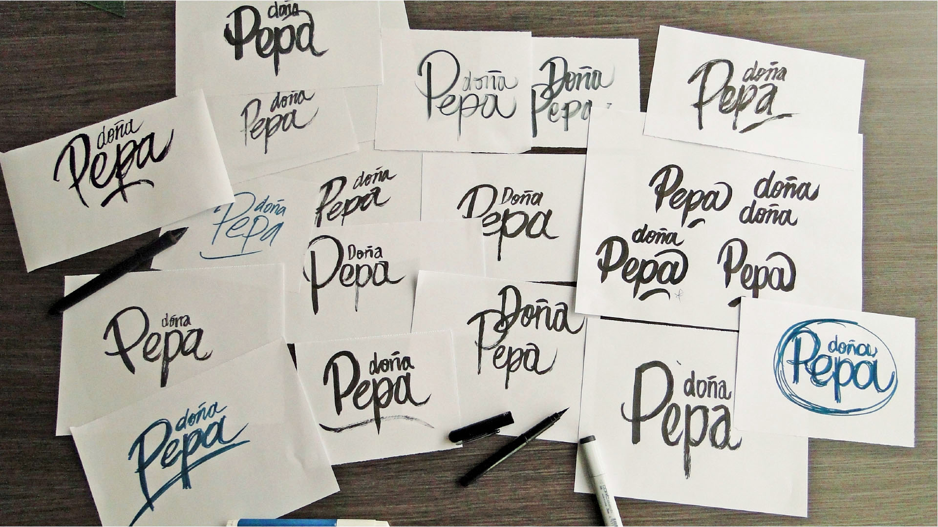
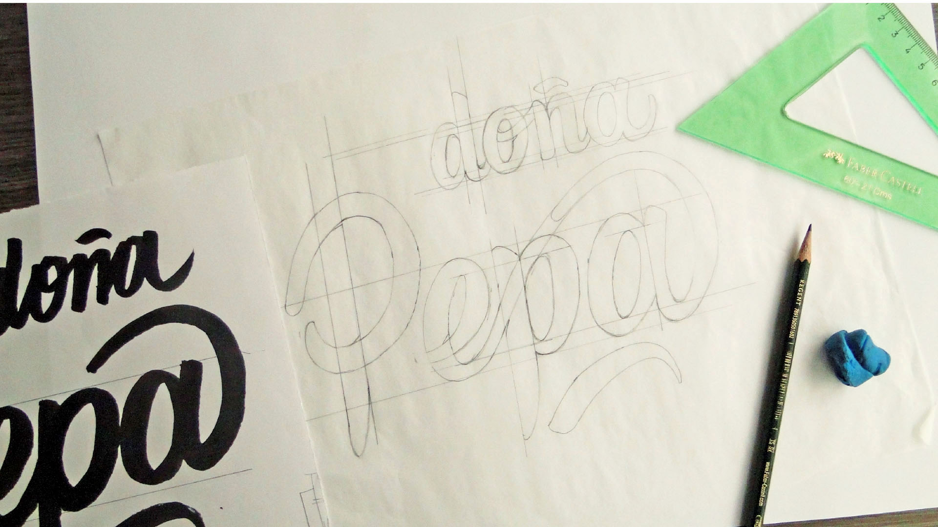
Rebranding for Doña Pepa.
We were introduced to the challenge of refreshing the brand identity of Doña Pepa, the only parboiled rice with a long-standing tradition in the market of the ORF company, a very important rice firm in Colombia. The goal was not only to attract new audiences, but to make the previous ones fall in love once again with the brand.
Doña Pepa is a product with several benefits but had the need of refreshing their visual identity to communicate clearly its attributes to its consumers. We analyzed their previous visual system and, standing on consumer research we proposed a new strategy.
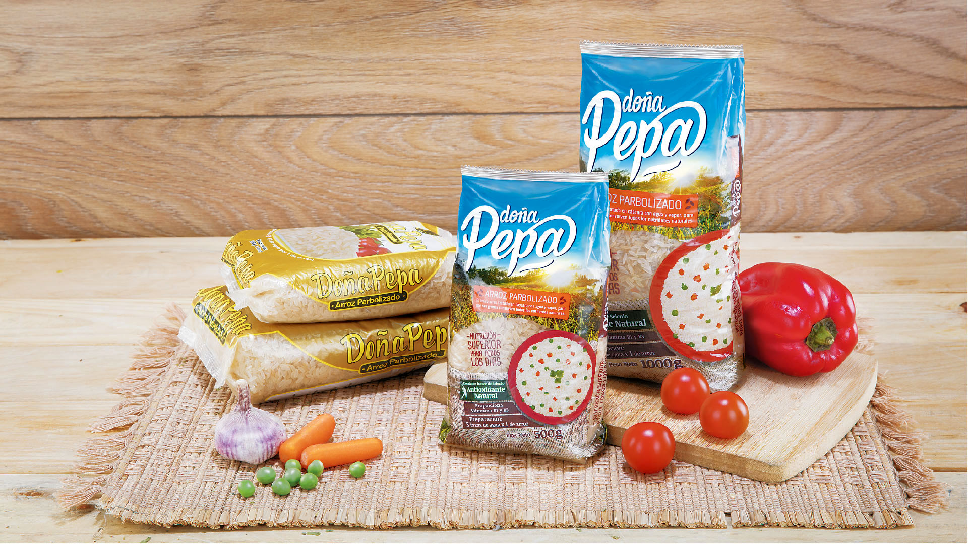
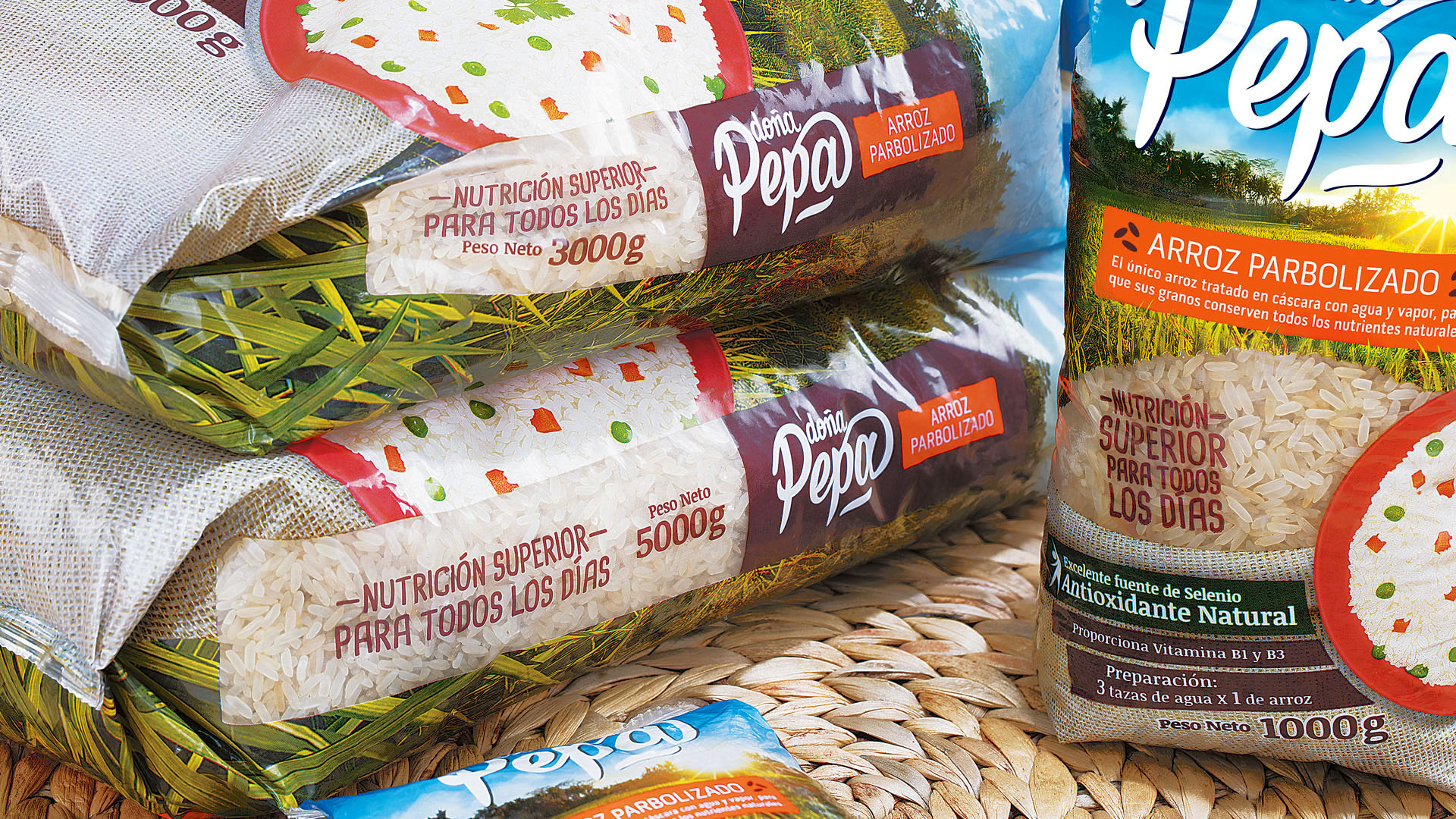
Having a previous strategic foundation, and a powerful communication concept, we reached the opening of a new category of rices. To achieve this, we built a strong visual system. Within the system of the brand, the colors, photography, graphic elements and the product window in the packaging worked together as a whole to communicate the messages in an effective and clear way, conveying every benefit of this variety of rice.
During this rebranding process, we knew how important it is to have a clear and strong visual communication in the point of purchase. The design is based on research that proposes good practices in laying out the elements that make up the graphic design of the packaging. Everything is designed to work correctly when customers look at the label before making the purchase decision.
This packaging design has been listed in The Best Nuts and Grains Packaging Designs Awards by DesignRush.
Info
Branding, Packaging