Agrosavia


Agrosavia
We worked in the redesign of the corporate branding of Agrosavia. We designed to meet the brief of making this government institution closer to farmers.
The challenge
The Colombian Corporation of Agricultural Research chose us as their allies in a big challenge. This organization leads the transformation of the agricultural sector in Colombia through scientific knowledge and the implementation of new technologies. Our challenge was to communicate the brand’s spirit through their corporate branding.
In the research phase of the project, we made semi structured interviews and strategic workshops to get to know the organization in depth. Using our methodologies we guided the client in the naming process for the brand, as well as the redesign of a visual identity system that reflects the scientific and specialized character of the brand.
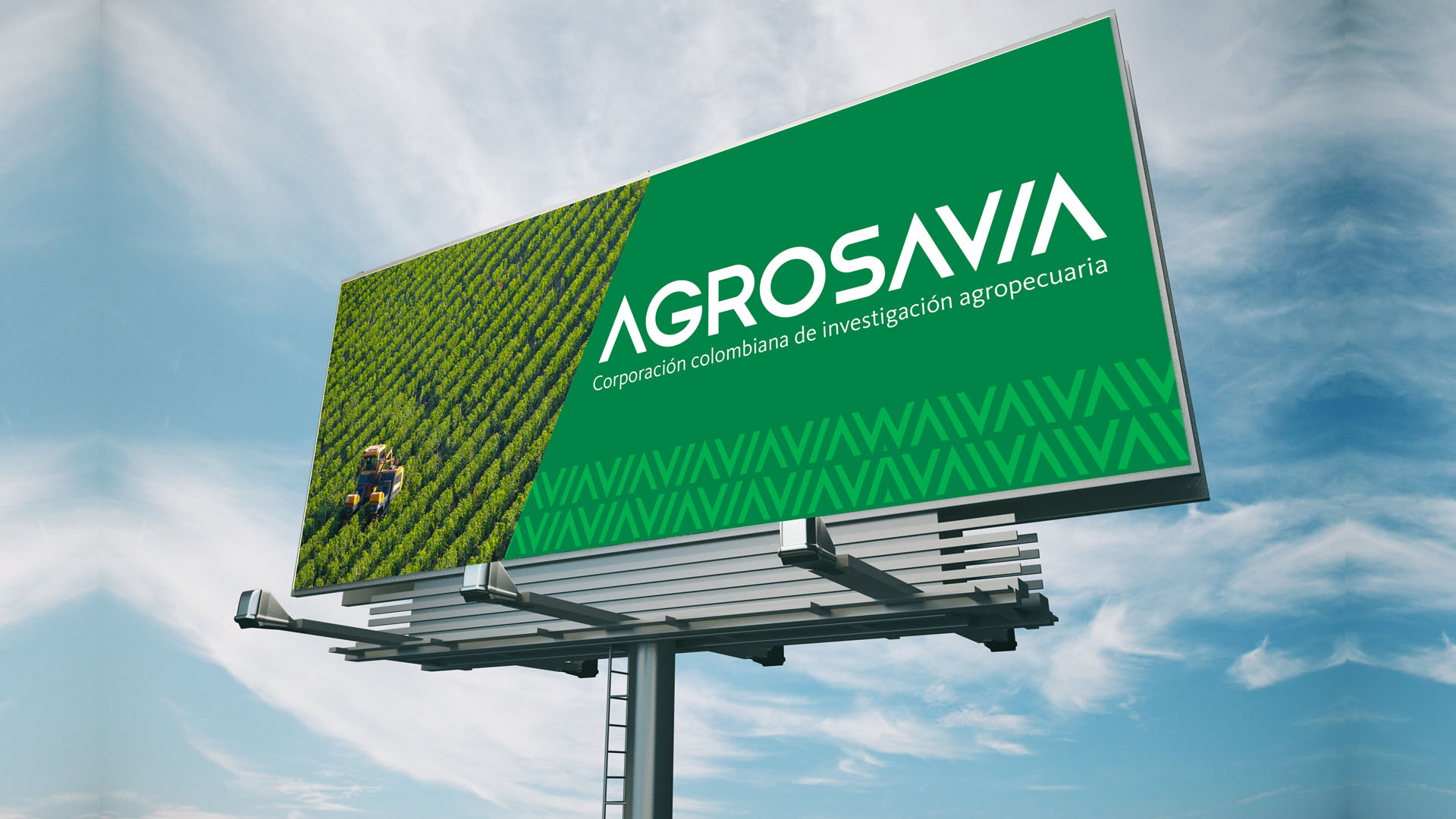
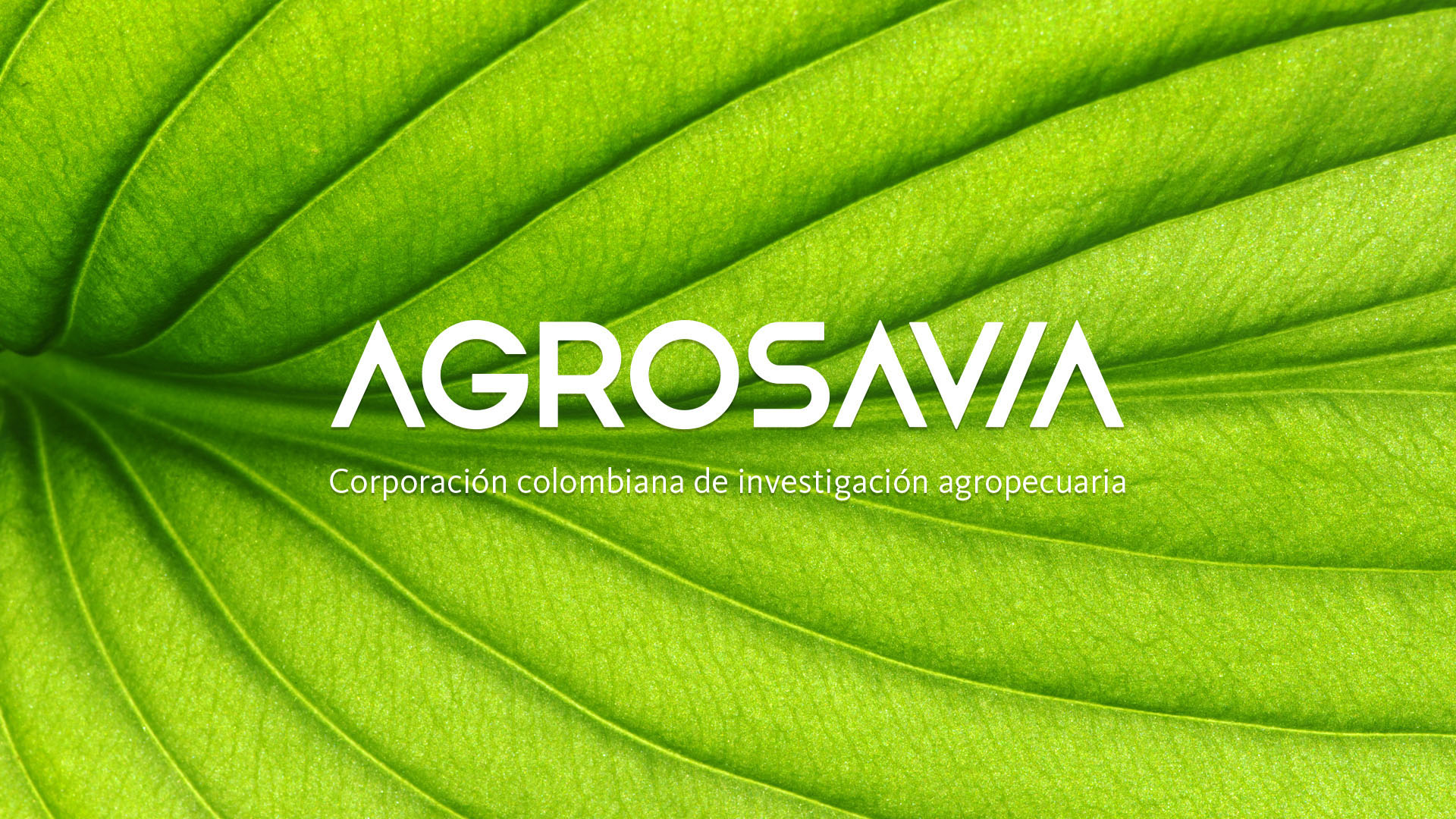
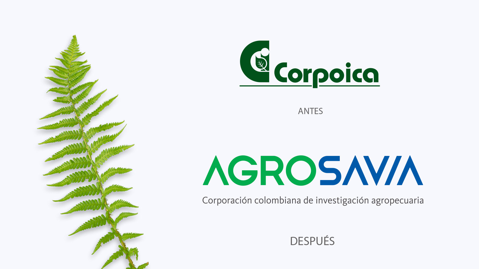
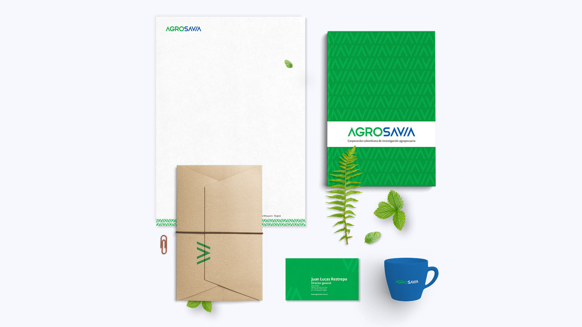
We explored different conceptual and creative routes and finally found the two fundamental words of the new identity: Agro and Savia. This naming identity was inspired in the Colombian farmers, as well as in the sap (savia in Spanish) that runs through the plant’s veins. We designed a visual communication system and logo that is both modern and functional, and that adapts to different contexts. Before, the organization was called Corpoica, a rigid and cold name, that did not convey the spirit and heart of the scientists that work in research to help the Colombian agriculture. The name change allowed the audiences of Agrosavia to connect in a more direct way with the purpose of the brand. Helping position the organization with an emotional bond to the farmers. The word savia, sounds similar to the word wise in spanish.
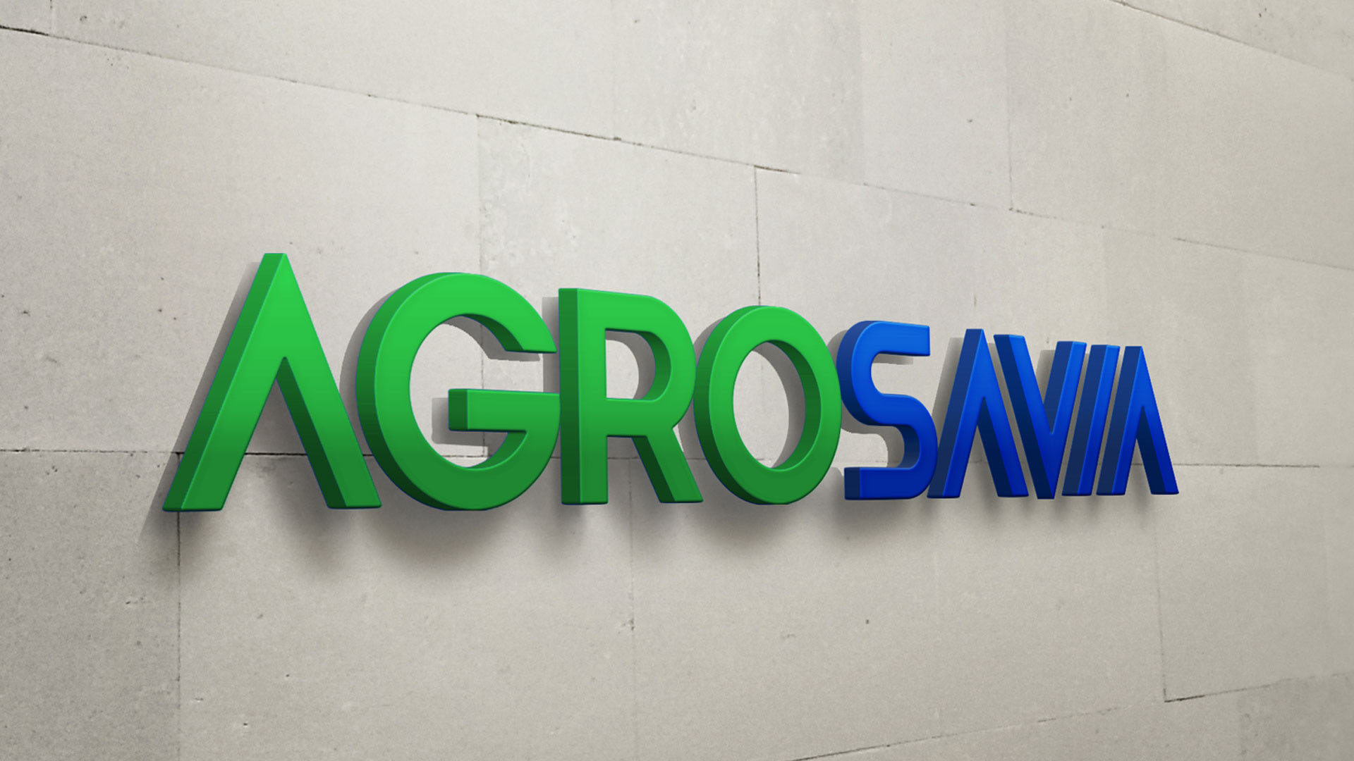
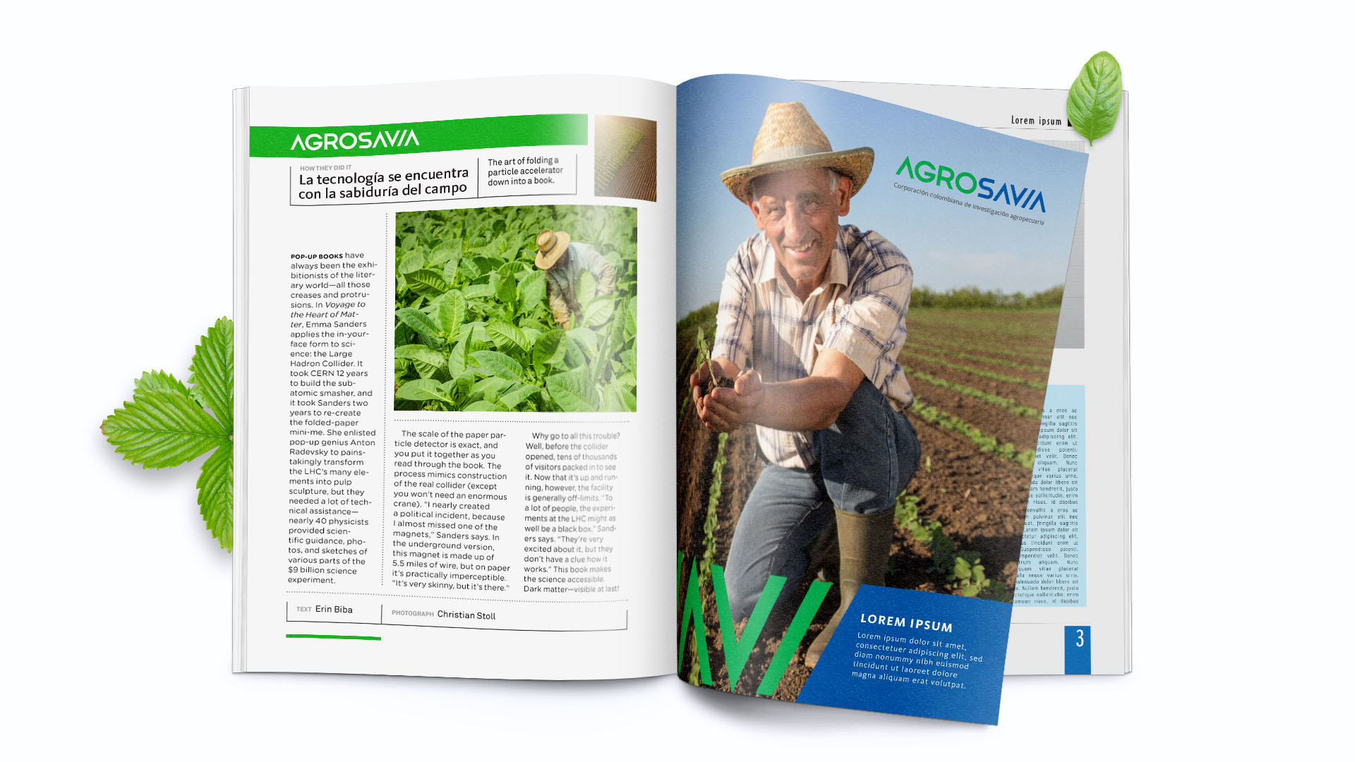
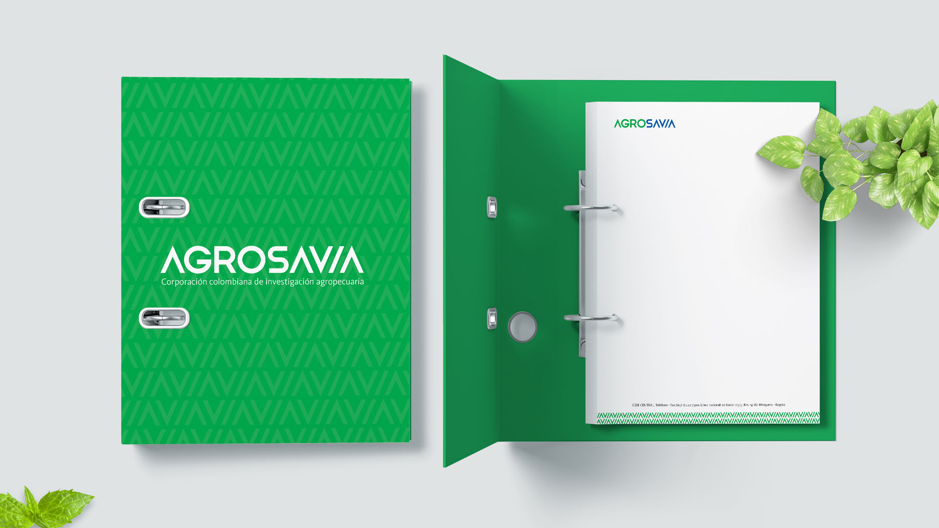
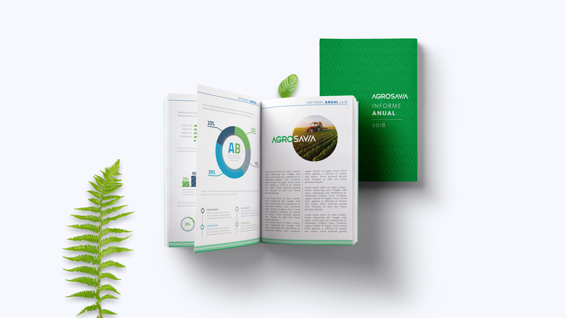
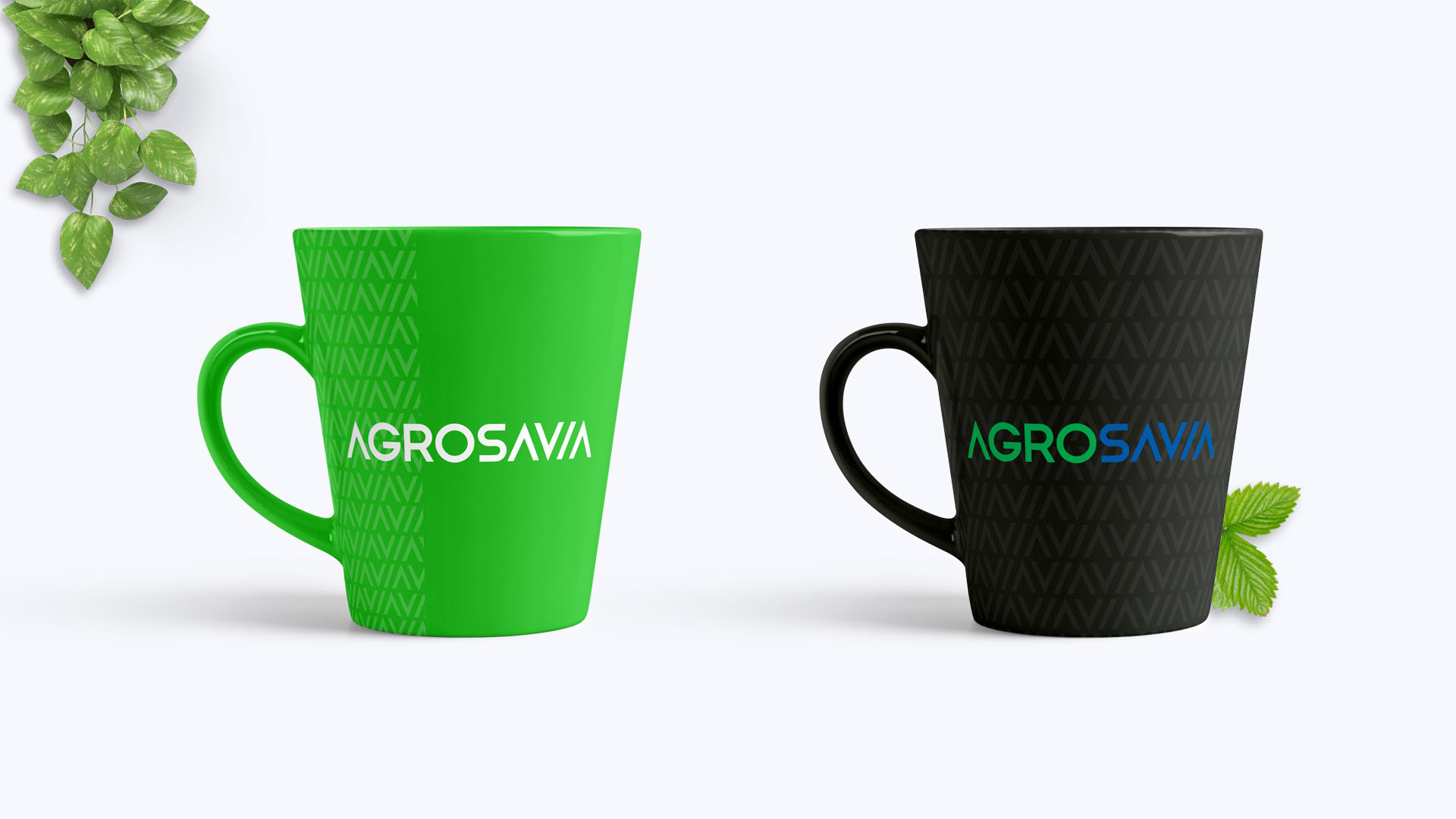
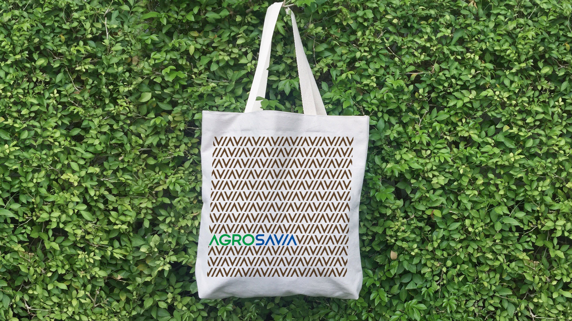
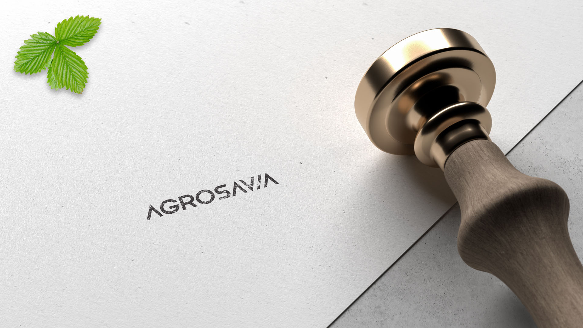
After defining the new name, we designed a visual identity system that is modern, functional and adapts in different applications.
“The impact we achieved by changing our naming and visual identity has reinforced the vision of the corporation. Thanks to this teamwork our brand identity breathes and communicates our highest purpose.” Juan Lucas Restrepo, CEO of Agrosavia.
Info
Branding