
POP Lipton
POP Lipton
Our challenge:
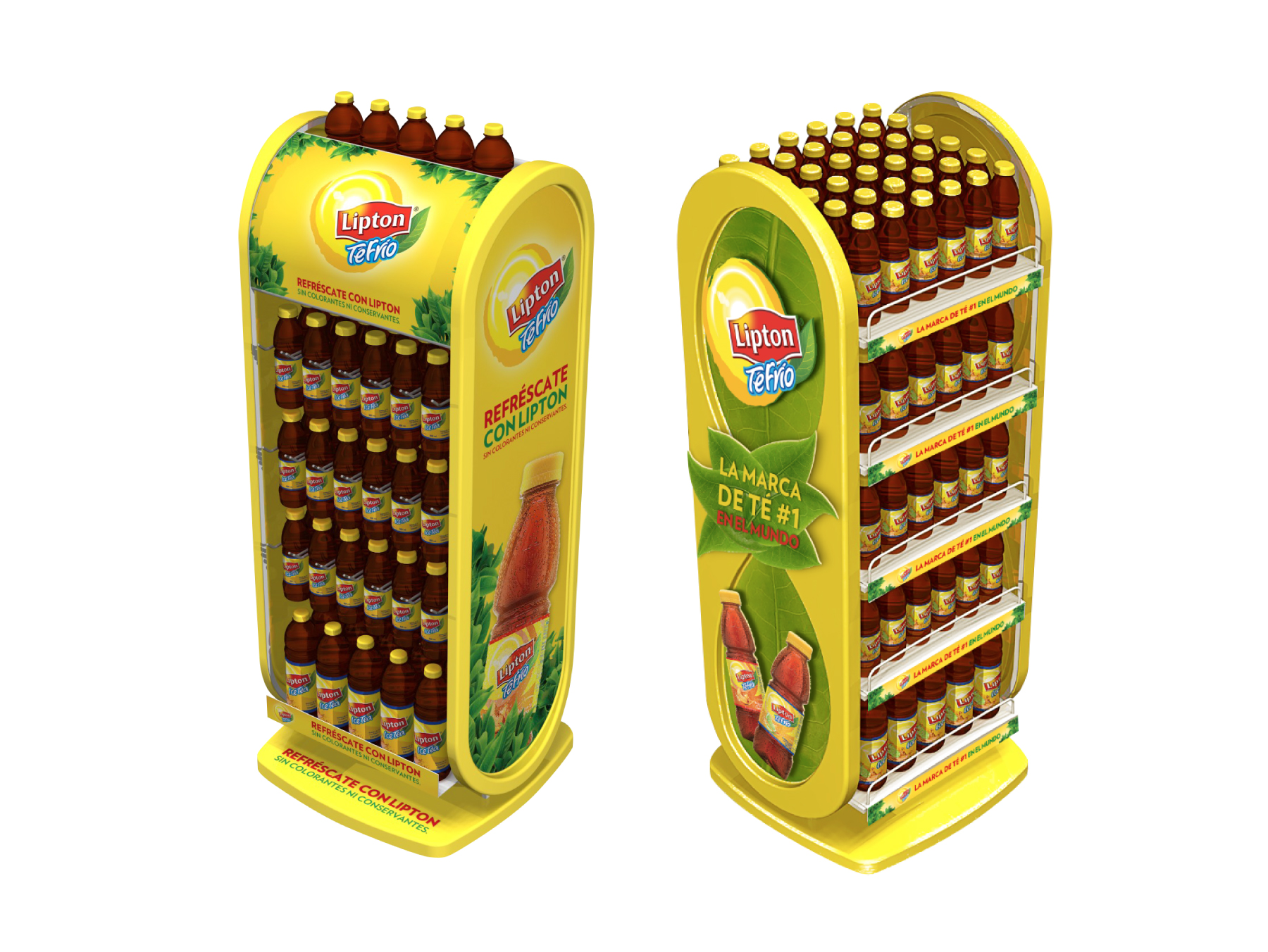
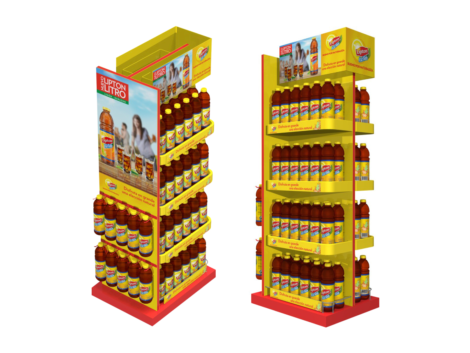
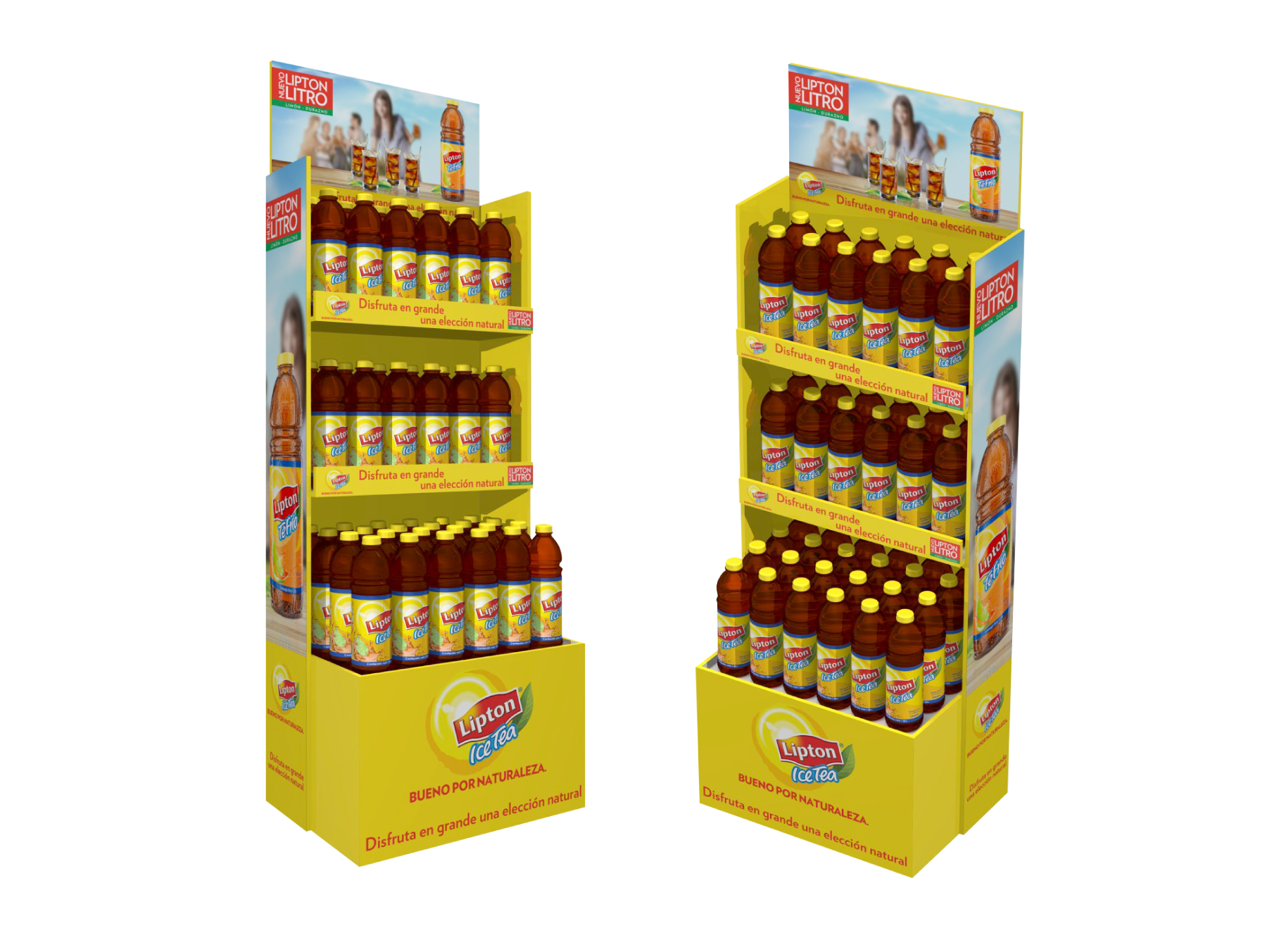
POP (point of purchase) material design for Lipton. Supermarket shelf display design is a very important touch point for mass consumption brands. The design of this type of display must excel at reflecting a brand’s essence. POP material purpose is to stand out from the competition on the shelves.
In this project for Lipton Ice Tea, we worked together with Sancho BBDO, adapting different campaign visuals to Point of Purchase pieces. For these designs, based on strategic thinking, we used one of Lipton’s greatest brand assets: the yellow color. The predominance of color makes it easy for the consumer to see the block of product displayed on the shelves, and inevitably turn to look at the product on display.
To design the furniture, we analyzed different touch points the brand could have in a supermarket. Based on this, we designed each piece of furniture according to its function and visibility. We used embossed elements to bring the tea leaves and the bottle to life. These elements enhance the presence of the graphic elements of the furniture and help capture the eye of the consumer.
The design of POP material, along with label design, is essential for any mass consumer product. That’s why we always seek to base our design decisions on a strategic approach that takes into account costumer journeys.
Info
P.O.P. material