
Serfinanza

Serfinanza
Our challenge was to work in the naming and graphic design for this brand. Serfinanza, a financing company, became a bank with the challenge of uniting two worlds: the corporate banking world and personal banking world.
How can we change without losing the valuable brand reputation that has been built? How can we communicate there is a new focus yet capitalize on the existing brand image? Naming (a brand’s name) is one of the most important assets for a brand, it only changes in very specific and special ocassions.
In this special brief we always kept in mind that the previous SERFINANZA brand had gone a long way and achieved valuable things in the corporate world. However, to address the new focus of personal bank it had to convey friendliness and nearness.
As a result of customer research and analysis, the simple change to SERFINANZA was an optimal solution, capable of meeting the brief in a functional way.
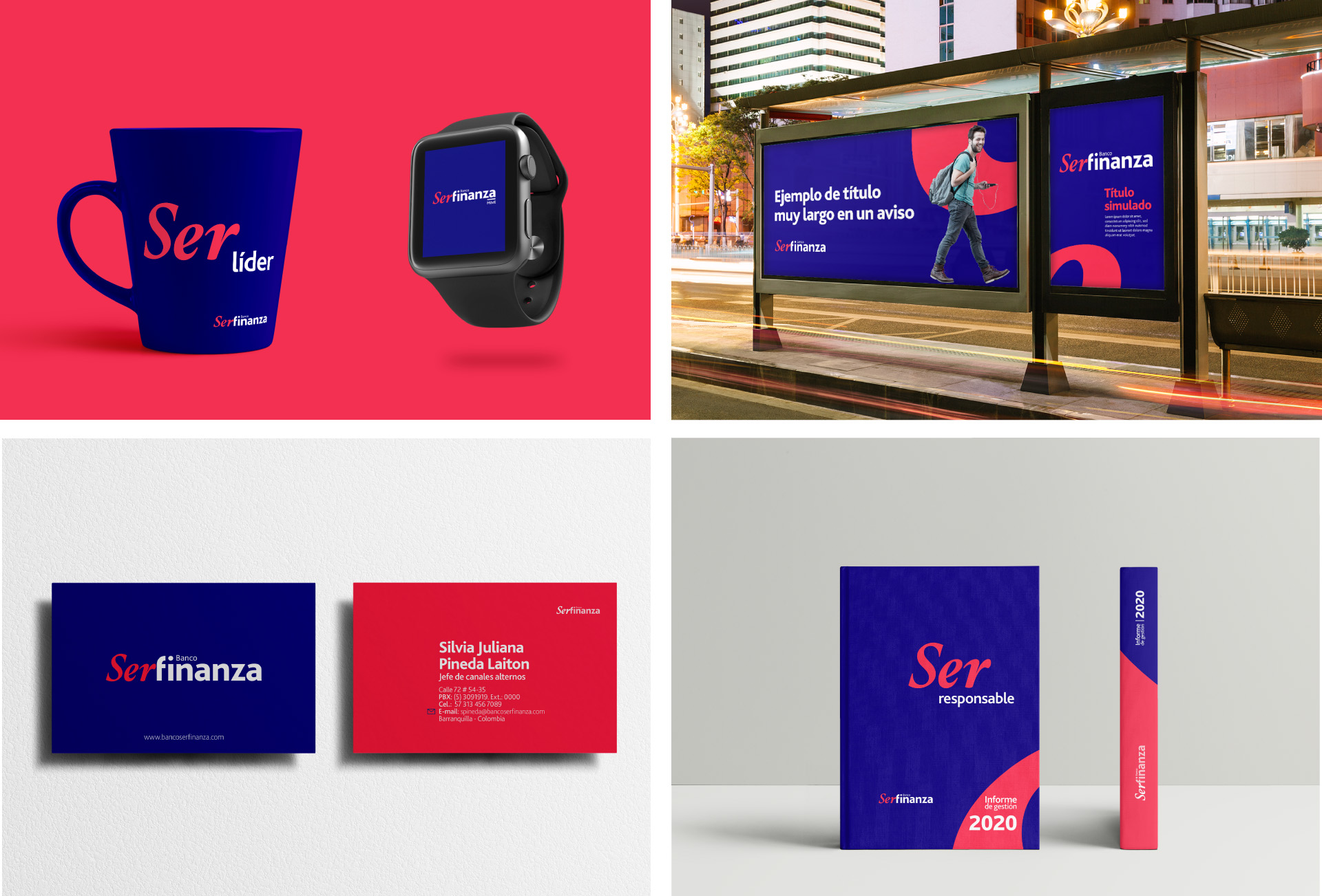
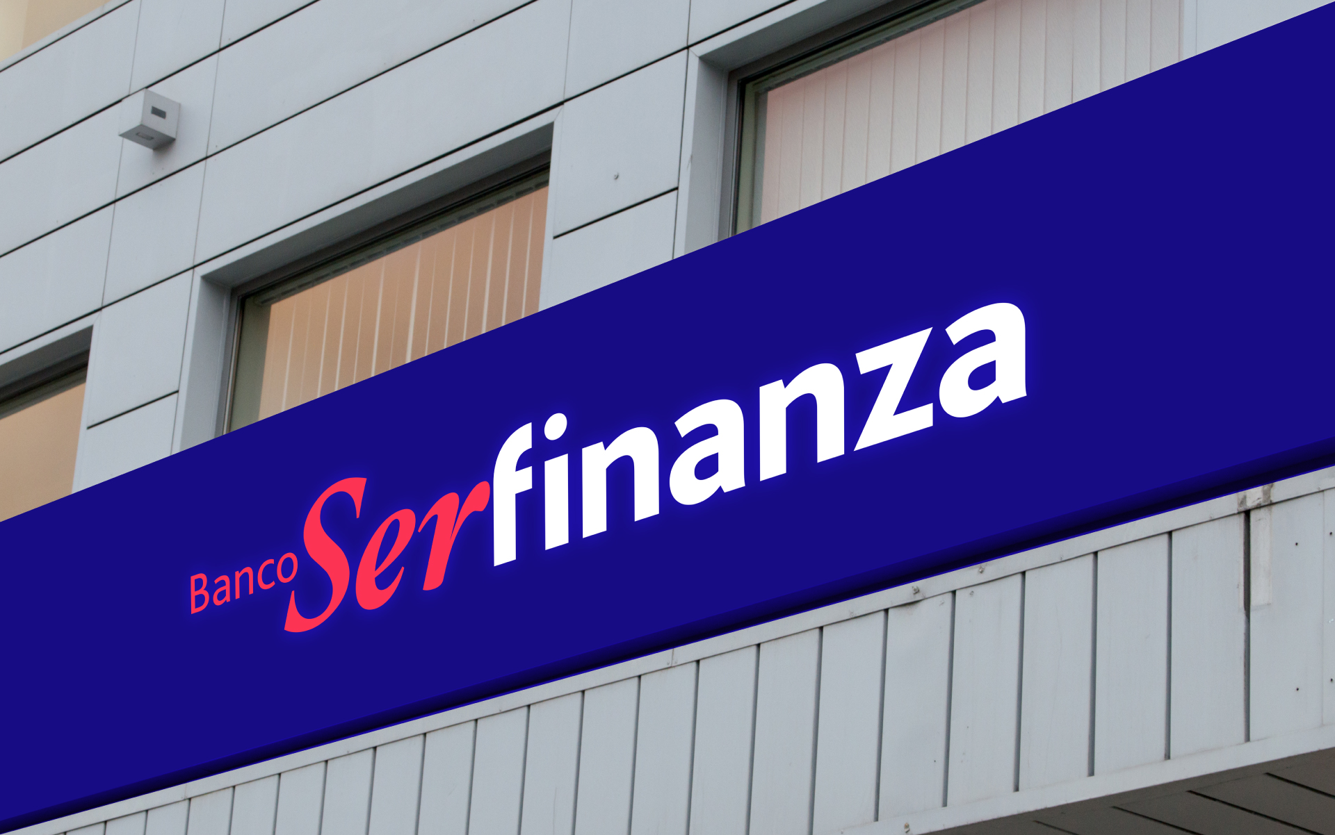
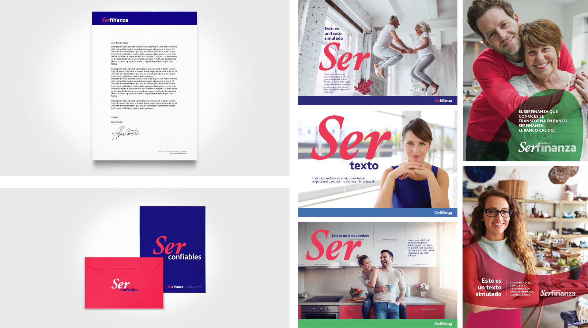
Ser, in Spanish means to be. This part of the naming is highlighted in the logo both with a special typography and a contrasting strong color, aiming to communicate the strong focus of the bank in the people that want to grow and need support to accomplish their goals. Finanza (finance in spanish), represents the focus on the corporate bank present within the company.
For the brand’s identity system we chose red and blue as main colors. These two colors are contrasting, yet combine in the perfect way. The selected hues allow the brand to communicate a balance between the human feel and the corporate feel the brand needed to convey. With bold graphic elements, we represent the boldness and greatness of the dreams every client of Serfinanza has.
For the visual communication we built upon the word “Ser” (being). He highlighted the word in the poster designs. In the brandbook we suggest the communication is always paired up with texts that speak about personal growth, achievement of goals and accomplishment of dreams. We designed a visual system that complements the logo in communicating nearness and trustworthiness, focused on people and on being.
Info
Branding